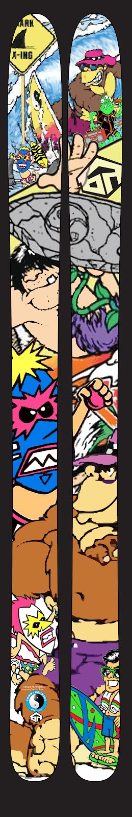
If you got to pick what goes on your top sheet of your skis, what would you choose? I think there are some great graphics out there and others that just stink. However someone may hate what you like and vice versa. I am sure some people will find my graphics disappointing. It seems the older I get, the COOLER the 80’s get. The 80’s had some great movies and TV shows, great music, and my favorite colors of all time: NEON. For me, there was also the great Town and Country Surf design. My uncle was a rep for them back in the day and I had my share of their merchandise. I loved the characters and bright colors of the surf themed designs. I thought I was so cool in those shirts…and let’s face it…I was! If you don’t remember them, take a look at this link: http://stevenazar.com/tcsurfdesigns4higherres.html . Those characters were drawn by Steven Nazar. If you don’t recognize these characters you can check out his website. He had some other well known and great t-shirt graphics out there back in the day. I am excited about my graphics and I will post a picture of the final graphics once it is all put together. I want to give a shout out to my co-worker and graphic designer Kenzie Morris for helping me put my vision together. You rock Kenzie!
The length of my ski will be 186 with dimensions of 140-115-131. Tip rocker and small tail kick. The flex should be a medium tip and medium/stiff underfoot with a stiff tail. I want a Dynastar XXl type ski with a bit more side cut, tip rocker and a similar flex (maybe a touch softer). The building process should start next week and I hope to be cruising down the mountain on these skis by the end of the month. Can’t wait to see the finish product.
No comments:
Post a Comment